
Mr. Yuk ultimate website
I redesigned and implemented designs for the Mr. Yuk ultimate frisbee website. (Mr. Yuk is the CMU men’s ultimate frisbee team)
Overview
Impact
+300%
increase in average page views
The problem
The website was outdated and the limited visual content on the site didn’t represent the culture of the team.
Biggest research insight
For Potential Recruit Pete, proving through season results that the team was “good” was a high priority.
My role
UX designer & developer
User interviews
Information architecture
Prototyping
Usability testing
Interaction design
HTML, CSS, JQuery
Personas
Other sport Omar
Persona quote - “[I’m] looking for a decent level of competition and low key team camaraderie…”
Potential recruit Pete
Persona quote - “I want a team that takes it fairly seriously and hopefully is not bad so I can learn…”
New student Nate
Persona quote - “I hated cross country. I like playing frisbee… how can I get involved?”
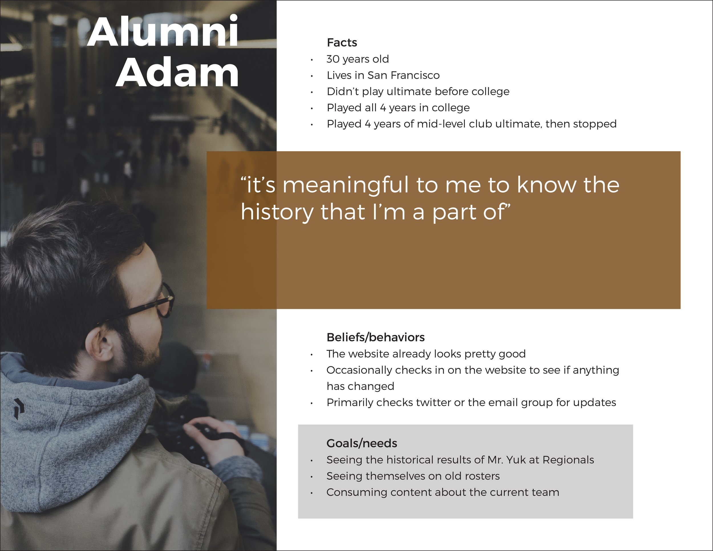
Alumni Adam
Persona quote - “It’s meaningful for me to know the history I’m a part of”
Timeframe
5 months - UX + Eng work
Final concept
Primary CTA flow
The primary conversion for New Student Nate and Other Sport Omar is to add them to the team email list. The landing page CTA makes this easy by only requiring an email, removing the friction of a user having to think about what to write in a message.
Secondary CTA flow
The contact page tells Potential Recruit Pete where CMU is located, an important part of understanding the team, while providing self-deprecating copy and a fun interaction.
Demonstrating team culture
For Other Sport Omar and Potential Recruit Pete, I wanted highlight reels to be easily accessible to show the ability and culture of the team, the latter being reinforced by a hidden easter egg interaction.
The process
User personas
To create these personas, I used interviews, surveys, and old emails from team members when they were first accepted to CMU.


Usability testing
I ran multiple think aloud user tests, for example, asking users how they would find “team info”. I combined the “team info” and “history” pages from the old website into the “about” page and wanted to test if this would confuse users.

User flows
Some of the persona goals, for example, “see if the team is good”, weren’t easy to translate into exact conversions, making the exact flows a bit challenging at times.

My reflection
What was I right about?
I was right that coding the website, in addition to designing it, would be a much richer learning experience.
What was I wrong about?
Based on metrics from the original website, mobile usage was rare, so I didn’t use a mobile first approach. However, I think the limited mobile usage on the original website was likely because the site wasn’t mobile friendly.
What would I do differently?
I would’ve checked accessibility on every page and spent more time making the website easy to update.