
Automated incident findings report
The report was a key customer deliverable which was automatically and manually populated throughout the investigative process.
Overview
Impact
64%
decrease in analyst work time on
a customer deliverable
(22min to 8min)
The problem
The larger problem was that Expel SOC analysts frequently created BEC and CM incident findings reports, taking up crucial SOC capacity with repetitive work.
The problem I faced was that the content for the report greatly differed based on the initial information available and subsequent analyst actions.
Biggest research insight
After an end user request, I followed up and was able to clarify the end goal given the negative implications on the rest of the workflow.
My role
Lead UX designer
Stakeholder interviews
Interaction design
Documentation
The users
Expel SOC analysts
Persona quote - “I always ask myself, how could this bite us in the ass if we’re wrong?”
Internal user who spends 10 hours per day in Workbench
Customer analysts
Persona quote - “I want to get Expel more context so they make the right decision”
External user who monitors numerous security products beyond Workbench
Terminology
| Incident findings report | Deliverable for customers when they have a security compromise (AKA a security incident) |
| Workbench | Expel's platform that ingests customer security alerts and where Expel SOC analysts triage alerts |
| BEC | Acronym: "Business email compromise", a common type of security incident |
| TL;DR | Green UI I designed that summarizes a incident findings report, stands for "too long didn't read" |
| SOC | Acronym: "security operations center" |
Timeframe
2 months - UX work
5 months - UX + Eng/QA work
Contributors
Emily Garton - Lead UX
David Spigarelli - Lead Eng
Pat Conley - Eng
Patrick Duffy - PM
Fred Mottey - QA
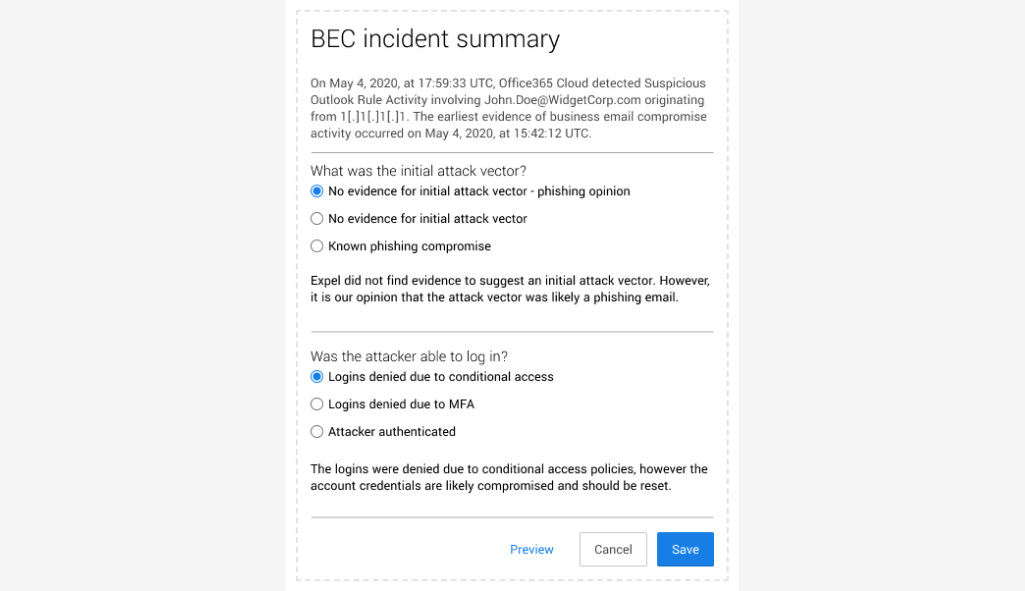
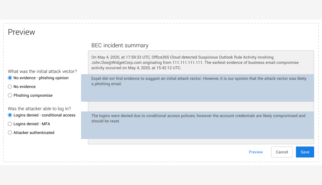
Final concept
Old vs new workflow comparison
The reporting workflow was significantly streamlined in comparison to the old workflow.
Use case - less data
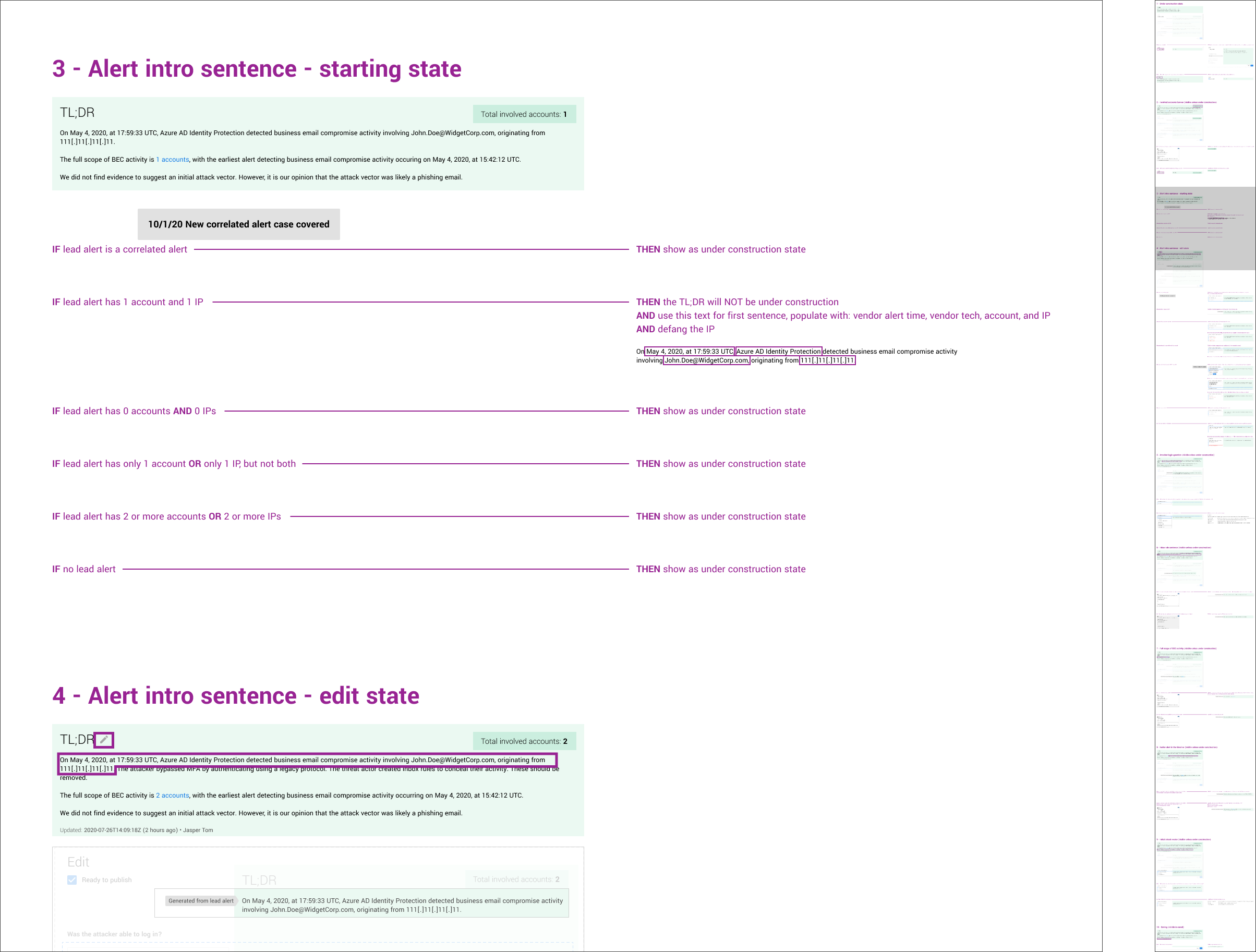
This shows the TL;DR covering a less common use case where the incident report starts with significantly less information.
The TL;DR automatically updates with information as it becomes available while allowing the analyst to decide when to publish the full content.
The process
Developer head start
Working from where the developer started, my iterations focused on showing how the TL;DR was being generated, by manual or automated action.


Analyst feature request
An analyst requested an additional dropdown in the TL;DR that would need to be manually updated as the incident report was filled out.
I tried increasingly complex UX to accommodate this request, until I got the feedback at UX critique, “hmm, this looks pretty complicated…”
Realizing this wasn’t just complex from my viewpoint, I talked to the analyst and we reached a simpler, “good enough workflow” that covered the vast majority of use cases.

UX documentation for engineering
After a few miscommunications, I asked the engineer I was working with about the last time he checked the UX documentation. When he responded he hadn’t in months, I worked with him to structure the documentation in a way that made sense to him.
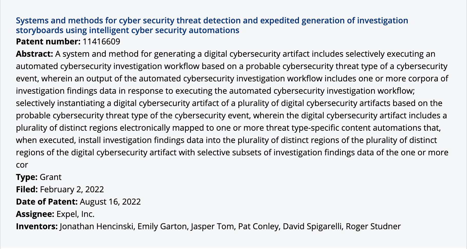
The patent I’m an inventor for.
My reflection
What was I right about?
I was right about displaying the manually editable UI side by side with a preview of what the content would look like published. This structure was able to address numerous use cases despite increasing complexity.
What was I wrong about?
I was wrong in my understanding of how the engineer was using my UX documentation, wasting time on notation that wasn’t used, for example, exact pixel spacing.
What would I do differently?
After the initial release of the feature, the quantitative results were so promising that we didn’t seek out qualitative feedback beyond monitoring Slack for qualitative feedback, which turned out to be all positive. I think the quality could’ve been improved if we had a streamlined procedure to gather qualitative feedback, whether negative or positive.